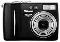
Nikon 7900 review

The Nikon 7900 review is posted on dpreview! This review took a bit longer then I expected. When the Canon SD500 was reviewed on the 17th of April, the photos were compared to the Nikon 7900! Therefor I expected the review within a few days afther than one. Anyway now it is here.
Like a lot of the camera’s in this range, the Coolpix is not a winner in low light focussing. A lot of contrast detection focus mechanisms are plagued by this ‘feature’.
As said before, this camera’s photos are compared with the Canon SD500 — which delivered more processed images, more saturated and slightly more details after sharpening. At ISO400 however the quality of the Nikon is much better then the Canon. ALthoug more grain is visible in the Nikon photo, the Canon os heavily processed and seems very soft.
As shown in the latest coolpixes, we get some nice software features included:
- Red-Eye removal — works pretty wel but is quite slow also. It takes at least 6 seconds to do the job.
- D-Lighting — Which hilights the darker parts of the image and saves them in a new file. It leaves the hilights as they are. Note that this feature is also available in Nikon Capture.
So all in all it might be good value for money for a 7mpix camera assuming that the focussing is not too bad. But I think I wait for the S1!
Comments
"The main mode dial sits atop the camera..."
That's what disturbs my feelings most for this camera (and a lot more of its competitors). Overal they look pretty good or better, but that awkward big wheel on the top of a stylisch body...
I have used cameras with no such dial; like the Nikon F50 and my current digicam, the CoolPix 5700. Such a dial makes it extremely easy to change modes. Otherwise you need to delve into the menu system and make your changes!
You won't have that dial on the S1! :)
JjJ: no probs with a dial. It surely is nearly as nice to have one as the usual 'Nikon command dial wheel(s)' on the (D)SLR's they make. But why should it be ugly?
The CP 7600 has a better desing, IMHO, with that dial placed in the back. Of course, it has an 1.8" LCD instead of 2"...
http://www.dpreview.com/news/0502/Nikon/nikon_cp7600specsview.jpg
We just can't have everything! :D
Well, I agree with Janco: my next camera will be a CP S1. I was thinking of a Sony T3 or T33 some time ago, but I really like the S1 more, specially the white/iPod one!
yes, lets hope it will focus good enough for us then! The S1 is also at the top of my whish list!